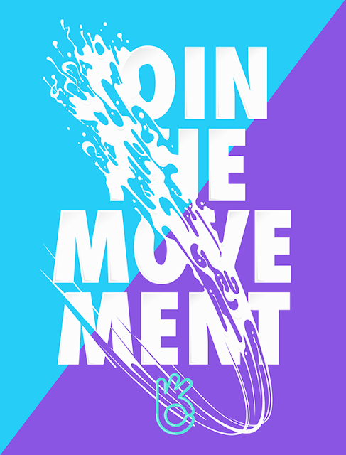
I chose this piece because it shows great movement and flow, the
"J" is unlike the rest of the message, but shown as a swoosh of
liquid. You can feel and hear the noise that this makes. This decision makes this letter stand out among the main text which are standing still. It creates great eye movement where the viewers eyes tends to move with
the letter down through the message and up again. The context of this design is
to create an illustration for a sports brand Bemove. Due to the bright colors of this
piece it tend to target young adults, most likely those that are active. The designer does use some traditional rules of type, such as using a main type that is readable, consistent letter and word spacing, etc., but then breaks some rules by having the J cut through the rest of the words,
but it helps this piece because this is meant to push or persuade people to be
more active, to be less stagnant, and by using the stroke of movement it
creates an overall good design.
